We all make mistakes, they can happen to people at the best of times. But when it comes to putting pen to paper and printing something permanently, it’s vital to double-check everything. Marketing and advertising are what helps us stay in business. It’s vital for us to make sure that we’re not publishing any bad graphic printing. You’d think people or even large companies would have the sense to double-check before they give things the go-ahead, but that isn’t always the case.
We’ve compiled 5 examples of bad graphic printing to show you that when this kind of thing goes wrong, it can go really wrong.
1. Formatting

A classic mistake seen all too frequently on vehicles with graphic printing is a lack of attention paid to text formatting. Even wealthy and global companies with as many resources as Starbucks are prone to bad graphic printing errors.
It’s important to be careful with any messages that could inadvertently be displayed to the public. While this is an amusing blunder, it’s not offensive and the overall ramifications won’t be damaging for the company.
However, if a rude or offensive word had been accidentally put on view then they could have faced more serious consequences. In this occasion though, they’ll just have to deal with a healthy dose of embarrassment.
2. Misleading Information
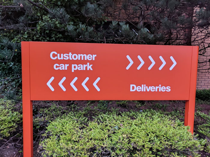
Here we have what appears to be a fairly standard sign, the type you’d typically see in a supermarket car park. At first glance, all seems to be well. But when you take a closer look, you suddenly realise that someone’s made a serious mistake with the design. The directions change when reading horizontally or vertically, which we’d like to assume was in no way the intended result.
This shows the importance of placing yourself in the shoes of the customer and looking at things objectively. It could help you to avoid wasting money and resources on producing something like this, which seems like it was created for the sole purpose of confusing people. Can you figure out this example of bad graphics printing?
3. Nonsensical
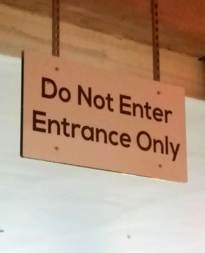
If you’ve ever needed any motivation to double-check your work, then this should be more than sufficient.
There’s not much to be said about this one really, but it does teach an important lesson. While it’s important to consider the more complex aspects of designs, it’s equally as essential to pay attention to the basics.
The only thing worse than a poorly designed sign that’s difficult to understand is a sign which doesn’t make sense at all. Not only is this sign such nonsense that it’s comical, but in busy areas, it could cause unnecessary mass confusion.
If a sign has a spelling mistake or a confusing image, at least people can still figure out the general message. However, in this scenario, it’s just a complete contradiction. People will have no idea what to do and could end up putting themselves and others in danger.
4. Inconsistency
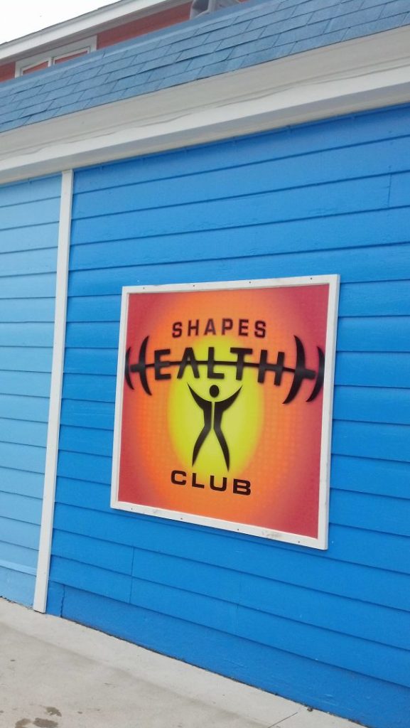
For any perfectionists out there, this sign will be particularly difficult to look at. The designer of this sign clearly showed creative flair by incorporating the first ‘H’ into the weights above the person’s head. So far so good.
But for some reason, they decided to not include the second ‘H’ in the logo. This missed opportunity results in a highly unsatisfying overall image which gets more aggravating the longer you look at it. Either they didn’t realise they could use the logo for the second ‘H’, or they did realise but they forgot to actually do it. Either way, it’s unforgivable.
Assuming the second ‘H’ in the logo still counts as a letter, then the sign now reads ‘Shapes Healthh Club’. This is a real shame as the logo would have looked really good had it not been for this elementary mistake.
5. Readability

When printing a sign, overlooking the font is something which really never should happen. Seeing as the vast majority of signs will have some kind of text on them, you’d think extra care would be taken to make sure the message is easy to read.
As shown in the image above, the poor font choice here has resulted in the message appearing to read ‘NEW STOCK ARRMNG DAILY!’ It’s not just the font choice though, it’s the size of the text and the closeness of the individual letters which has resulted in this catastrophic error.
This example, perhaps more than any of the others, highlights the importance of seeking professional help from an expert. There’s simply no way that someone with years of experience could allow for something as easily avoidable as this to make it to the printing stage.
If global companies with multi-billion dollar net worths such as Starbucks are capable of bad graphic printing, then it must be easier to make these errors than you’d think. We hope that you’ve seen enough examples of shoddy (and humourous) printing mistakes by now to never want to join the ranks of these poor designers.
If you’re ever in doubt, feel free contact us for professional consultation.
Recent Comments